What is the Color Theory Rule?
Understanding color is an essential aspect of art and design that can dramatically alter the aesthetics and effectiveness of a visual piece. The color theory rule provides a framework for how colors interact, complement, and create different moods and feelings. This guide delves into the principles of color theory, helping you grasp these concepts and apply them effectively.
Introduction to Color Theory
At its core, color theory is the study of how colors mix, match, and create visual harmony. It provides a set of guidelines that can be employed to create appealing designs, whether in graphic design, painting, interior design, or fashion. Understanding color also involves knowing the emotional impact of color combinations, which is crucial for artists and designers aiming to evoke specific feelings or responses from their audience.
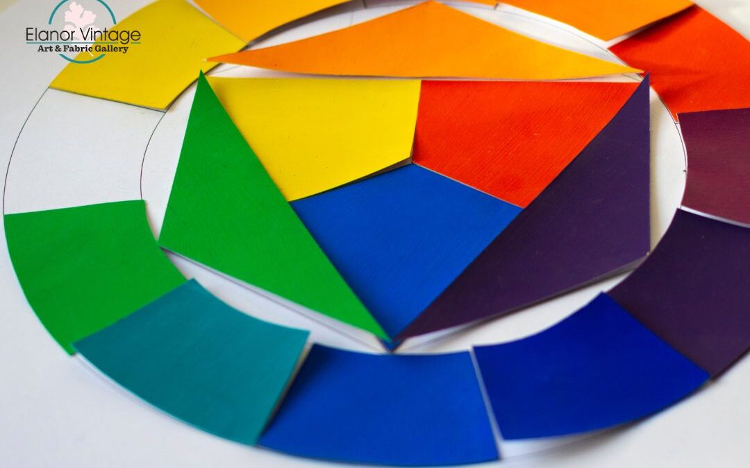
The Color Wheel
One of the foundational tools in understanding color is the color wheel. Developed by Sir Isaac Newton, the color wheel is a circular diagram that represents the spectrum of colors. It is divided into primary, secondary, and tertiary colors:
- Primary Colors: Red, blue, and yellow. These colors cannot be created by mixing other colors.
- Secondary Colors: Green, orange, and purple. These are formed by mixing pairs of primary colors.
- Tertiary Colors: These are created by mixing a primary color with a secondary color, resulting in hues like red-orange and blue-green.
The color wheel serves as a guide to understanding how colors relate to one another in a visual composition.
The Color Harmony Rule
Understanding color harmony is vital to using color theory effectively. Color harmony refers to aesthetically pleasing combinations of colors that create balance and consistency. Some popular harmony rules include:
Complementary Colors
Complementary colors are opposite each other on the color wheel. For example, red and green or blue and orange. When paired, complementary colors enhance each other’s vibrancy, making them stand out even more. This rule is often used in design to draw attention to specific elements.
Analogous Colors
These are colors that are next to each other on the color wheel. For example, blue, blue-green, and green. Using analogous colors creates a serene and comfortable design. This approach works well for backgrounds or when you want to create a harmonious theme throughout your work.
Triadic Colors
The triadic color scheme employs three colors that are evenly spaced around the color wheel, such as red, yellow, and blue. This combination provides a vibrant and dynamic appearance while maintaining balance. Understanding this rule is essential for creating bold and lively designs.
Split-Complementary Colors
This involves a base color and the two colors adjacent to its complementary color. For instance, if green is the base color, the complementary color is red, and the split-complementary colors are red-orange and red-purple. This rule offers a high contrast while making sure there’s a cohesive color palette, which can be particularly useful in complex designs.
Psychological Impact of Color
Understanding color goes beyond technical combinations; it also involves the psychological effects that different colours can have. Colors can evoke a range of emotions:
- Red: Passion, urgency, and excitement.
- Blue: Calmness, reliability, and peace.
- Yellow: Optimism, happiness, and energy.
- Green: Nature, growth, and tranquility.
- Purple: Luxury, mystery, and spirituality.
Incorporating this understanding into your designs can amplify the impact of your work, making it more engaging and meaningful for its audience.
Practical Applications of Color Theory
To effectively implement the color theory rule in your designs, consider the following practical applications:
- Graphic Design: Use color harmony to create visually compelling images and branding that resonates with your audience.
- Interior Design: Apply understanding color principles to create atmospheres in different spaces—calming tones for bedrooms, energizing colors for workspaces, etc.
- Fashion: Utilize the color rules to put together outfits that create striking visual contrasts or harmonious blends, depending on the desired effect.
- Art: Artists can create works that convey mood and emotion by thoughtfully applying color theory.
Final Thoughts
Understanding color and its theory is an indispensable part of creating visually appealing art and design. By grasping fundamental concepts such as the color wheel, harmony rules, and the psychological impacts of color, you can greatly enhance your projects. Whether you’re an aspiring artist, a seasoned designer, or just someone looking to spice up your home decor, mastering the color theory rule will empower your creative processes. By combining colors thoughtfully, you can evoke intended emotions and create a lasting impression. Take the time to explore, experiment, and bring the vibrant world of color into your work!
Visit our blog page for more interesting articles